Over the past few years I have had the pleasure of designing a New Years poster that Mary Lo of the Public Affairs Bureau's Ethnic Media Relations Unit presents to the Chinese media outlets in Vancouver.
The unfortunate aspect of the project is its compressed timeframe. This year, the design needed to be completed in a day and nine prints output and framed the following morning so as to meet the presentation deadline!
Last year's "Year of the Tiger" poster was very well received.
The Greater Victoria Art Gallery was a great source of inspiration for this poster which was 8x17 in size.
I decided to keep the size of the 2011 rabbit poster 11x14 both so the cost stayed in line and to take advantage of readily available stock materials.
The fook character was created several years ago when the tour first began, and I have used it ever since. The tessellation in the blue background was derived from a cloisonne box the gallery had on display - can't remember the dynasty off-hand. The ink tiger was drawn from photo and painted sources.
As mentioned, this poster was well received (and quickly approved by the minister's office), so it made sense to continue with the visual theme but perhaps introduce even more cultural symbols to both liven it up and give it more depth.
One of these symbols is the knot. Several websites pointed to Lydia Chen of the National Palace Art Museum in Taipei as a major proponent of this cultural tradition. Images at many of these sites provided a great deal of inspiration.
Below is a glimpse of the design roughs. The first obvious upgrade was to consider replacing the simple red diamond card with a knot of good fortune like the one above.
Consideration was also given to replacing the gold cloisonne arc with a gold braid.
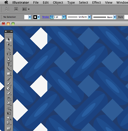
A blue knotted, woven background replaced the cloisonne tessellation. Take note how simple the actual illustration is, but how effective when viewed at a distance.
However, once these components were completed in Illustrator and placed in InDesign, it became readily apparent that even the MacPro didn't have the horse-power to composite these elements and output the file quickly enough. Unfortunately, I scrapped the concept in order to deliver the posters on time.
To simplify the design meant to bring it down to its essence. As 2011 is the year of the rabbit, and knowing from Uvic's experience how quickly rabbits multiply, it only made sense to make a simple tessellation of rabbits and use them in the background instead or the complex knots.
This meant employing a technique I learned from the illustrator, Darcy Petley, with whom I had the pleasure of working while at Disney. Darcy is a master of Illustrator's calligraphic pen stroke. While sorting through several of his digital illustrations one day, I discovered he didn't use a flat pen, but a round nib that was set to adjust in size depending on the pressure of the Wacom stylus' stroke. This was a revelation, and I have used this technique since with amazing results.
You can see the simplicity of the rabbit images below when viewed as outlines. Once the strokes are created, the linework is expanded and then erased where it strays too far. Then I use the pathfinder to join all the paths into a single, grouped object. Draw the fill with a bezier path using the pen tool and voila!.
Once all the components are created in Illustrator, they're composited in InDesign where the type is set. I find Illustrator is a very difficult tool to set type with. As well, InDesign seems to handle colour profiles much better and more consistently than does Illustrator. As this project was output on the Graphic Design Unit's in-house Epson 3800 archival ink-jet printer on beautiful Moab Entrada Bright White stock, InDesign was the hands-down tool of choice to ensure the colour profiles Moab offers stayed intact and the image output accurately.
It was difficult finding a typeface for the year, given the odd configuration of "ones." Eventually, Kris Holmes' Lucida Blackletter from Elsner+Flake fit the bill despite its odd cultural references. I set the "Year of..." with Carl Crossgrove's quirky Origami from the Monotype foundry.
A while ago, my talented colleague, Don Craig, researched the dickens out of the available archival printers and papers and hit on the Epson 3800 (now the 3880). It has been an amazing workhorse for our design unit, especially for very short print runs like these posters. When printing on a gorgeous paper stock like Legion's Moab Entrada, the resulting prints are stellar. It takes a fair amount of fiddly dialogue box dancing, but the output is worth it.
Here is the Epson churning out another print while the Opus frame awaits. The other component of the job was the framing. This was also an in-house job (me, using Opus' 16x20 black metal exhibition frames and Chai pre-cut mats. The cost was substantially lower than in previous years, and the results were just as good.
The finished product ready to box and ship to Mary Lo's Vancouver office with the eight others. Not bad for a day's work.
From: Lo, Mary PAB:EXSent: Wednesday, February 02, 2011 03:55 PM
To: Lisa M PAB:EX; Karen PAB:EX; Jones, Calvin PAB:EX
Cc: Marisa PAB:EX; Alison PAB:EX; Ron P PAB:EX
Subject: Press visit
Dear all,
A great, successful Chinese New Year Press visit today. Good weather, no traffic, good parking and ahead of schedule.
Everybody loves the poster. All noted the rabbit background and loves it. Minister is warmly greeted.
Thanks everyone!
Mary


