

Saturday, October 24, 2009
At the Light table
Tuesday, October 06, 2009
Snow Day 004

The Greater Victoria Public Library has a wonderful "Local History Room" on their main floor where I just found these 2 gems. The tiny handbook, ABC Guide to Victoria and Vancouver Island was published by Harold Diggon's Government Street print shop in 1928 and is great example of the typography of that era. Odd to see the iconic typeface of the 1960's - Cooper Black - used throughout.

Cecil Clark's The Best of Victoria, Yesterday and Today: A Nostalgic 15-Year Pictorial History of Victoria published in 1973 is also part of the GVPL's Local History collection. The images of "present day" 1970's Victoria are almost as dated now as the images of yesterday! This image of Government Street and Broughton illustrates the heavy use of overhead electrical power lines. Funny to see so much traffic on Government in the bottom image as it's now only two lanes of north-bound traffic.
Sunday, October 04, 2009
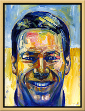
Saturday, October 03, 2009
Snow Day 003
Starting to consider models for the main characters, Samantha and Miss Prewt. Right now, Samantha looks like she just stepped out of a Miyazaki film about Anne of Green Gables. I like Miyazaki, but I'm not sure if this is working for me just yet.

Egon Schiele's harsh line work is almost a no-brainer reference for Miss Prewt as Margo has described her. This is starting to work. I'll expand on this approach.

Infrastructure 20091003
As discussed in previous sketches, I'm using "blanket" as a metaphor for infrastructure's intent to comfort and protect us against isolation and the elements. Taking this metaphor further, I hope to highlight the inability of many folks to purchase and maintain the growing number of infrastructure "blankets" required for contemporary living which unfortunately then leaves them disadvantaged. That said, living in Canada, I can't believe I haven't considered the iconic Hudson's Bay Company Point Blanket as a possible medium.
This image, an advertisment from a 1960 publication of The Beaver magazine, is from the Hbc website describing the history of their point blanket. While the HBC point blankets are made in England by John Atkinson and Sons, they are a Canadian icon and very possibly a wonderful medium and reference for this project given their historical significance. Even the simple wool blankets that Atkinson markets are distinctive in their appearance with their silk or nylon border. Funny how one can see something so often that it become nearly invisible!

Hbc blanket colour range: Multi-stripe, Camel, Green, Scarlet, detail from a 1950 advertisement in The Beaver. I believe there's a scarlet blanket folded in one of my Mom's storage trunks.
Hbc blanket colour range: Multi-stripe, Camel, Green, Scarlet, detail from a 1950 advertisement in The Beaver. I believe there's a scarlet blanket folded in one of my Mom's storage trunks.
Subscribe to:
Comments (Atom)