Saturday, December 24, 2011

At the Light Table 014

The lamp-post banner designs I created for the City of Victoria a few summers ago continue to be repurposed by the city's Downtown Community Development Coordinator, Mike Hill.
A while ago, I was asked to re-deploy the pink salmon motif on a bike lock-up outside of the Mountain Equipment Co-op on Government. Recently, Mike asked if I could re-jig the motif to wrap an electrical junction box, similar to others the city has around town.
The thought behind wrapping these structures with artwork is to deter graffiti and vandalism. Artists won't tag another's artist's work. Duchamp was probably sick the day that lesson was taught.

However, the scope of this small project slowly changed from a junction box to the new Portland Loo on Langley Street.
I had re-designed the salmon image to tile around the junction box, but the loo didn't need a tiled wrap, just a couple of panels for insets.

Ideally, I would love to re-jig the work to wrap the structure (because there's a lot of uncovered area ripe for tagging), but I'll leave that for Mike to ponder. Maybe his crew would consider a wood panel or cedar shake motif with a moon on the door.

Saturday, September 17, 2011

The Muse

Werner Herzog is one funny guy.

One of the film's most inspiring moments: French archaeologist and former circus uni-cyclist, Julien Monney, shares a story about an Australian aborigine who is asked why he feels he must touch up an ancient rock painting. The aborigine replies, “I am not painting. The hand of the spirit is painting.”

Geist Werk Leben.

Thursday, September 15, 2011

At the Light Table Lucky 013

Designers and illustrators know the drill: "It would be great if we could see something today."

This assignment to create an infographic for a new "Jobs" initiative the Province of British Columbia is developing turned out to be a lot of fun despite its compressed time-frame. My manager, Andrew Pratt, had already doodled a concept for the piece. Andrew stressed he wanted to include "Lego men."
Thankfully, he had located many of the resources and statistics for the piece and there was no size constraint aside from width. So I quickly roughed out a concept on paper (for the most part) to set my mind straight.
Working with population statistics is fine, but these tables proved to be somewhat onerous.
Tara Kerner-Marsh, my co-worker and fellow designer, had already typeset many of her infographics with Sebastian Lester's Neo Sans, so it was an easy decision to use this typeface.
Creating the colour palette, too, was an easy task given Cossette West, the communications agency charged with much of the province’s advertising, had contracted Dare in Vancouver to devise the "Canada Starts Here" identity for the initiative. By-the-way, Dare is a "brand building agency for a digital world, not a cookie company" according to Rob Sweetman, their Executive Creative Director. 
One of the enjoyable tasks was creating Andrew's "Lego men" icons of the top B.C. industries hiring over the next 10 years: Sales and Service; Business, Finance and Administration; Trades, Transport and Equipment Operators; Management; Social Services, Education, Government and Religion; Health and the Natural and Applied Sciences. I am a big fan of the Always with Honor crew from Portland, OR. It's probably obvious, eh?
I didn't use Lego's face for the figures, but after a simple exploration I arrived at something that was suitable and in keeping with Andrew's vision.

Drawing the icons with Adobe Illustrator went quite quickly once I developed a base mannequin (the green gent on the left). I added to or subtracted from him depending on the costume. Yellow seemed the obvious colour choice for their skin and a homage to Lego.
The completed industry icons.
Developing some of the charts was also a bit of fun. Andrew had created a "British Columbia in Squares" map a while ago. I thought this would lend a clean, high-tech appearance to the piece. However, when coupled with the economic regions of the province, the thing (below) became a mess. I abandoned it for a more conventional map of the province.
The chart to the right of the more conventional map (below) breaks down the anticipated number of job openings per economic development region. It was almost a no-brainer to use small, iconic people for this.
Total working time was probably 6 hours from start to finish, not including the hemming and hawing. Once the initiative is announced, I'll link you to the site to see the finished graphic.

Sunday, September 11, 2011

Infrastructure 20110911

On the recommendation of a friend, I just finished reading author Daniel Quinn's "Ishmael." The author won the one and only Turner Tomorrow Fellowship Award of $500,000.00 for this novel about a gorilla who tries to teach the narrator and others there is a way to live in greater harmony with the natural world.
The gorilla, whose name is Ishmael, makes the point to the narrator several times throughout the story that the advent of agriculture in the fertile crescent of Persia 6000 years ago changed man's view of nature and led to the advent of work, religion, laws and the myth that the natural world was created for man to plunder. Agriculture allowed man to act like the gods and so decide what species should live and which should die. This then led to monocultures and, ultimately, man's current industrial agriculture techniques. A thought-provoking book which I coincidentally finished just as the American restaurant chain, Chipotle, began to release a series of videos around this same theme of agricultural sustainability.

Monday, September 05, 2011

Infrastructure 20110905

The Ford Taurus wagon died.
It brought home how expensive vehicles are to operate. How many of us consider this when we buy one. My wife and I kept most of the receipts for the Taurus' maintenance and insurance. It was a bit of a shock to estimate what we spent on the car before it died.
Add to this gasoline at 129.9 cents per litre (approximately 35 cents per gallon in the USA) for a 50 litre fill and, holy dolly, we're looking at an additional 1612 dollars every year on gasoline alone. Ahem, that's like a couple of extra mortgage payments.

Thanks to Greg, Mark and the crew at the Fairfield PetroCan for helping us dispose of the Taurus. Rest in peace, Big Blue.

Saturday, June 25, 2011

Infrastructure 20110625

$100—front/rectoThe Bank of Canada just released to the press information regarding their new polymer banknote series. However, in their online description of these new banknotes, no mention is made of the art directors and designers involved in the project, only general aspects of the images depicted on them. Like the air we breathe, graphic design is ubiquitous and transparent. However, without it, I know we would only last a good 7 minutes before expiring.
____________________________________

From: Julie Girard
Sent: Wednesday, June 29, 2011 5:45 AM
To: Jones, Calvin
Subject: RE: New Banknotes, Design

Hello Mr Jones,

Thank you for your interest in the new Polymer series of bank notes. As you are probably aware, issuing a new series of bank notes requires the work of many people including graphic artists. We have indeed highlighted the work done by graphic artists in the Museum and we are doing so again. The Bank has developed a series of short videos that feature research and development, design, production of notes, etc. IN the design video as well as a short snippet of b-roll (video used for media outlets) we have images of one of the Bank designers, Jorge Perral. In conjunction with the release of the design video, we are also planning on issuing an article that will be distributed to over 3,000 media outlets across Canada.

Furthermore, at the recent unveil ceremony of the new bank notes, (link to webcast: http://www.bankofcanada.ca/media-room/webcasts/ and click on the June 20 webcast) dignitaries highlighted the contributions of the important stakeholders that worked on the new notes.

I hope this answers your questions.

Julie Girard
____________________________________

Julie A. Girard
Senior Analyst - Media Relations| Analyste principale - Relations avec les médias
Currency Department | Département de la Monnaie
Bank of Canada | Banque du Canada
234 Wellington Street (2 West), Ottawa, Ontario, K1A 0G9
www.bankofcanada.ca/en/banknotes | www.banqueducanada.ca/fr/billets

Monday, April 25, 2011

At the Light Table 012

The sweater has iconic status on Vancouver Island. Since the Scots brought textile arts and knitting from the Fair Isle in Scotland's Shetland Islands, the chunky sweater has become synonymous with the Cowichan tribe from the beautiful Cowichan Valley. First Nations knitters still create these popular sweaters using traditional techniques and materials. Many, like Vancouver's Granted and TNA have emulated this style of sweater in their contemporary catalogues, and craft giant Mary Maxim is proud to boast Bob Hope wore one of their designs while visiting Canada.

Sweaters and blankets, I must love the textile arts!

Sunday, April 17, 2011

Infrastructure 20110417

Both Bernard Chapais and Kim R. Hill in the March 2011 issue of the American Association for the Advancement of Science's Science Magazine speak to kinship relationships and deep social structure as being the root of what it is to be human. Hill et al. hypothesize in their article that humans' kinship arrangements and the resulting large social networks led to the social learning that resulted in cumulative culture. As Hill explained succinctly on CBC's radio show, Quirks and Quarks, no one human could build a space shuttle on their own, but many humans collaborating and contributing each in their small way led to the space shuttle's development. Is kinship and maintenance of familial relationships a core infrastructure?

Friday, April 01, 2011

At the Light Table 011

Vancouver Island's history — both political and geological — is brimming with independent, creative spirit. Personalities like Amor de Cosmos, Cougar Annie and Emily Carr are but a few of the characters that have inhabited this island paradise. Geologically, studies at UBC and other institutions point to evidence the island is a remnant of a rogue oceanic plateau formed out in the Pacific while the other continents were heaped together as Gondwana. Only recently has it crashed into North America to create the Salish Sea, Rockies and other formations. Given its peculiar history, it seems appropriate that, as BC Ferries continues its unrelenting drive to isolate islanders from the mainland, we Vancouver Islanders embrace this spirit we have been bequeathed by nature.

Long live Wrangellia and long live the spirit of the island!

Wednesday, January 26, 2011

At the Light Table 010

Over the past few years I have had the pleasure of designing a New Years poster that Mary Lo of the Public Affairs Bureau's Ethnic Media Relations Unit presents to the Chinese media outlets in Vancouver.
The unfortunate aspect of the project is its compressed timeframe. This year, the design needed to be completed in a day and nine prints output and framed the following morning so as to meet the presentation deadline!
Last year's "Year of the Tiger" poster was very well received.
The Greater Victoria Art Gallery was a great source of inspiration for this poster which was 8x17 in size.
I decided to keep the size of the 2011 rabbit poster 11x14 both so the cost stayed in line and to take advantage of readily available stock materials.
The fook character was created several years ago when the tour first began, and I have used it ever since. The tessellation in the blue background was derived from a cloisonne box the gallery had on display - can't remember the dynasty off-hand. The ink tiger was drawn from photo and painted sources.
As mentioned, this poster was well received (and quickly approved by the minister's office), so it made sense to continue with the visual theme but perhaps introduce even more cultural symbols to both liven it up and give it more depth.
One of these symbols is the knot. Several websites pointed to Lydia Chen of the National Palace Art Museum in Taipei as a major proponent of this cultural tradition. Images at many of these sites provided a great deal of inspiration.
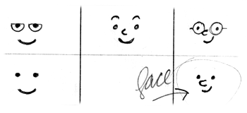
Below is a glimpse of the design roughs. The first obvious upgrade was to consider replacing the simple red diamond card with a knot of good fortune like the one above.
Consideration was also given to replacing the gold cloisonne arc with a gold braid.
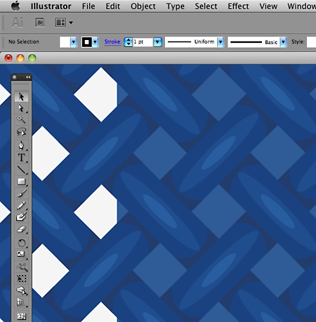
A blue knotted, woven background replaced the cloisonne tessellation. Take note how simple the actual illustration is, but how effective when viewed at a distance.

However, once these components were completed in Illustrator and placed in InDesign, it became readily apparent that even the MacPro didn't have the horse-power to composite these elements and output the file quickly enough. Unfortunately, I scrapped the concept in order to deliver the posters on time.
To simplify the design meant to bring it down to its essence. As 2011 is the year of the rabbit, and knowing from Uvic's experience how quickly rabbits multiply, it only made sense to make a simple tessellation of rabbits and use them in the background instead or the complex knots.
This meant employing a technique I learned from the illustrator, Darcy Petley, with whom I had the pleasure of working while at Disney. Darcy is a master of Illustrator's calligraphic pen stroke. While sorting through several of his digital illustrations one day, I discovered he didn't use a flat pen, but a round nib that was set to adjust in size depending on the pressure of the Wacom stylus' stroke. This was a revelation, and I have used this technique since with amazing results.
You can see the simplicity of the rabbit images below when viewed as outlines. Once the strokes are created, the linework is expanded and then erased where it strays too far. Then I use the pathfinder to join all the paths into a single, grouped object. Draw the fill with a bezier path using the pen tool and voila!.
Once all the components are created in Illustrator, they're composited in InDesign where the type is set. I find Illustrator is a very difficult tool to set type with. As well, InDesign seems to handle colour profiles much better and more consistently than does Illustrator. As this project was output on the Graphic Design Unit's in-house Epson 3800 archival ink-jet printer on beautiful Moab Entrada Bright White stock, InDesign was the hands-down tool of choice to ensure the colour profiles Moab offers stayed intact and the image output accurately.

It was difficult finding a typeface for the year, given the odd configuration of "ones." Eventually, Kris Holmes' Lucida Blackletter from Elsner+Flake fit the bill despite its odd cultural references. I set the "Year of..." with Carl Crossgrove's quirky Origami from the Monotype foundry.
A while ago, my talented colleague, Don Craig, researched the dickens out of the available archival printers and papers and hit on the Epson 3800 (now the 3880). It has been an amazing workhorse for our design unit, especially for very short print runs like these posters. When printing on a gorgeous paper stock like Legion's Moab Entrada, the resulting prints are stellar. It takes a fair amount of fiddly dialogue box dancing, but the output is worth it.
Here is the Epson churning out another print while the Opus frame awaits. The other component of the job was the framing. This was also an in-house job (me, using Opus' 16x20 black metal exhibition frames and Chai pre-cut mats. The cost was substantially lower than in previous years, and the results were just as good.
The finished product ready to box and ship to Mary Lo's Vancouver office with the eight others. Not bad for a day's work.
From: Lo, Mary PAB:EX
Sent: Wednesday, February 02, 2011 03:55 PM
To: Lisa M PAB:EX; Karen PAB:EX; Jones, Calvin PAB:EX
Cc: Marisa PAB:EX; Alison PAB:EX;  Ron P PAB:EX
Subject: Press visit

Dear all,

A great, successful Chinese New Year Press visit today. Good weather, no traffic, good parking and ahead of schedule.

Everybody loves the poster. All noted the rabbit background and loves it. Minister is warmly greeted.

Thanks everyone!

Mary