The final black and white image of the Garry Oak in Porter Park printed well off the little ink-jet. I have set up a grid of four by three to match the beautiful plywood panel I’ve ear-marked for this work.
A good friend and very creative woman in her own right, Lisa Zezza, helped me trim the plywood panel down to twelve 11.5 inch square panels with her table saw. “Why cut the panel up?” you ask. I don’t have space in my small office for the full panel, so will have to arrange to display it in twelve sections. I’ll figure that out later!
I monkeyed around with the wax, brushes, ink and linocut tools before settling in and feeling a bit more comfortable with this awkward medium.
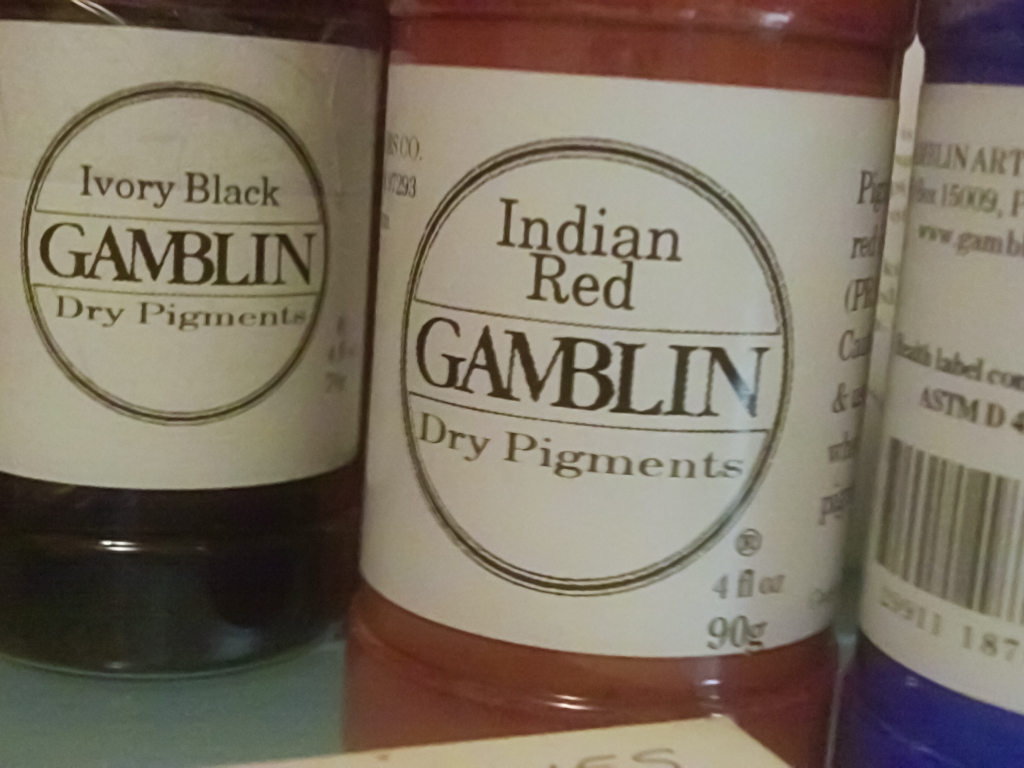
India ink washes on the wood panel establish the tree’s structure that I’ve roughed out with a Prismacolor red animation pencil. A bit nutty, I know, but it removes my worries about graphite smearing everywhere.The best part of this work is using these sweet Gamblin pigments from Portland. How about that name, though — Indian Red? Give me a break. Iron oxide is an adequate descriptor. Yoikes!
The palette for this work is simply iron oxide and bone black. Iron oxide was, according to Genevieve von Petzinger, the first pigment man used aside from charcoal black. So I figure this colour scheme is suited to a piece with as ancient a theme as lamenting the death of a friend.


